The Florida Project/A Ghost Story

Both made under the film studio A24, two films that have made a major impression on me this year are ‘A Ghost Story’, directed by David Lowery, and ‘The Florida Project’, by Sean Baker. Although different in agenda, what I took away from them mutually was the idea of time as a major theme, even though it was dealt with in very different ways.

A Ghost Story – Dir. David Lowery, 2017

The theme of time is more prevalent in A Ghost Story. Centred around the grieving wife of a man who dies suddenly in a car crash whilst he watches her as a ghost, unable to talk to her, it’s a story that explores the enormity of time, somehow managing to fit in hundreds of years worth of experience whilst simultaneously including scenes such as “a five-minute, uninterrupted take in which the wife eats an entire family-size pie slumped on the kitchen floor, then runs to the loo to throw up.”(1)
Even after the ghost’s wife moves out of the house, he stays trapped there, watching the lives of strangers unfold in the house that he should’ve been living in. This silent observation continues until the site of his old home is replaced by a large office building in the middle of a built-up city that has developed around him. He wanders the office block alone for some time until he decides to try and commit suicide (somehow) by jumping off the top of the office block. The scenes that follow are in my opinion some of the most poignant. Instead of leaving forever, he instead is transported back to the very beginnings of his home, and watches the initial stakes of the building being hammered in by a 19th Century European settler and his family. After a few weeks of living on the site and beginning to build the house, the family are killed by Native Americans. The camera lingers on the body of the family’s youngest child, before switching to the ghost watching her silently for a few seconds, unmoving. the camera then switches back to the girl, who now remains only as a rotting corpse, almost completely skeletal. This scene stuck with me as a particularly aching display of the scale of time, and dispelled an ongoing desire of mine to be able to observe a spot forever because of how painfully slow the reality of it is. Although it doesn’t end up being the case, the possibility of infinite time for this ghost is very real, and it’s terrifying.

Trailer:

The Florida Project – Dir. Sean Baker, 2017

If A Ghost Story is a longitudinal look at time, focusing on one place and moving up and down its entire timeline, then perhaps The Florida Project could be described as looking at time laterally, focussing only on the present but narrowing it down to look at a very small group of people in a set geographical location, providing the viewer with a modern-day ‘slice of life’ look into the experiences of a of society that’s often overlooked. Set over the span of a summer holiday, the film follows a 6-year old girl named Moonee living with her young mother in The Magic Castle Inn, a low budget extended-stay motel on W. Irlo Bronson Memorial Highway, Kissimmee, just miles from Disney World itself. It reminds me of J.G. Ballard’s 1974 novel ‘Concrete Island’, set in a derelict ‘island’ underneath the junction of three motorways leading out of London. This spot, so close to the urban sophistication of London, becomes the main character’s own personal hell, just out of public reach yet still very much present. The Florida Project runs in a similar, if less severe, vein.
In one of its reviews for the film, Mark Kermode (The Guardian) wrote, “It all adds up to another superbly sympathetic portrait of marginalised experience from a film-maker whose great triumph is that he never feels like a tourist. This is Moonee’s world, and for a couple of hours at least, we are privileged to live in it.” (2)
I do indeed find it an absolute privilege to be able to observe this world that I myself have been unknowingly so close to when visiting Disney Land as a child and again as a teenager. Although I don’t remember seeing The Magic Castle Inn itself when driving through Kissimmee, there are countless similar locations along the highway. As a 9 year old child, I didn’t notice these ‘in-between’ spots, but on my second trip aged 17 (which was more for my sister, who was 14 at the time) the ‘in-between’ times of driving past cheap gift shops, tiny churches with monumental crucifix’s and run-down i-Hops became a lot more interesting to me than the parks themselves. Although I didn’t get many, I tried to take photos along the highway (shown below) and often wish I could go back to the places in the photos and just observe them without being in a moving vehicle. The Florida Project gave me a chance to do that and I’m extremely grateful for it.

I am however aware that the purpose of The Florida Project isn’t to give viewers a pastel-pretty insight into this problem that they can forget about after watching, or simply ignore in favour of the cinematography. The problems faced by the characters in the film are as real as the motel in which it was filmed, and I don’t want to come across as voyeuristic or uncaring when talking about it. I tried to focus on the elements of the film that run more in parallel with what I’m trying to figure out within my own work, but I am of course mindful that that’s not the point of it, and nor should it be.

Trailer:

(1) https://www.theguardian.com/film/2017/aug/09/a-ghost-story-interview-david-lowery-casey-affleck-rooney-mara-pie

(2) https://www.theguardian.com/film/2017/nov/12/the-florida-project-review-sunshine-state-of-mind
Woven Works

Recently I’ve started to come back to weaving as a form of abstracting imagery. I like how little control it allows as a form of collage, how the whole of each image is present yet only 50% is visible. I suppose it ties into the idea of simultaneity that I’m looking at currently: just because I can’t see everything that’s happening in the world right now doesn’t mean it’s not happening, similar to the hidden 50% of a woven image.
I’m currently reading ‘The Aesthetics of Disappearance’ by Paul Virile (1). There’s a passage near the beginning of the book that touches on a similar subject, as shown below (starting at the line “Children are the most…”):


This idea of ‘patching up’ gaps in knowledge with experiences that we ourselves have observed; making mental assumptions and links in place of a knowledge that we will never possess, is something that is inherently human and vital in order to make sense of the world. It also applies to the viewing of imagery, particularly the abstract.
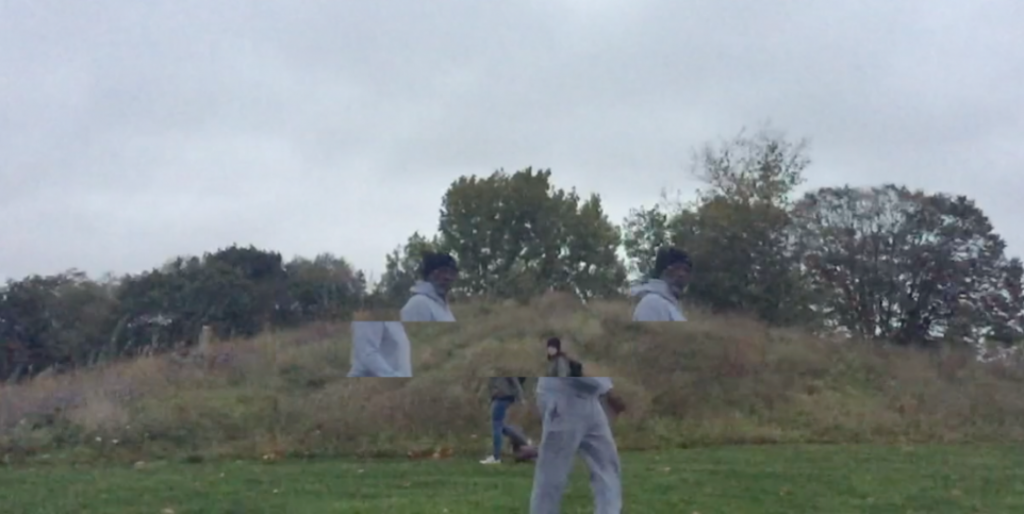
With this idea in mind, I scanned in a simple weaving (shown below) I had made out of 3 separate stills from the same wrestling video, weaving alternate strips from image 1 and 2 into image 3.

I then re-scanned this in and dissected it into the 350 separate squares that it’s now comprised of, creating 350 stand-alone compositions, each with their own individual potential of a narrative, a scene, a context.


When separated, these fragments become their own works, ranging from figurative to abstract. Like the Young Picnoleptic from the passage above, we use our own experiences and paste them onto new ones, ‘stretching our memories’ in doing so.

On a side note, it’s interesting how in blowing up the result of a physical paper weaving, the pixels of the image make a kind of woven aesthetic in their own right. I haven;t decided what to do with these 350 images, but this is something that I want to play with, perhaps using more physical processes such as embroidery to make a pastiche of this familiar digital aesthetic that’s so close in looks to the physical process from which it was derived.

(1) Virillo, P. (2008) The Aesthetics of Disappearance, Los Angeles: Semiotexte


Latest Painting


There were many stages of mental mock-ups that I went through before and during the execution of this painting, and I ended up having discarded almost all of them by the end of it. I can’t decide whether it works as a whole, but there are certainly elements of it and happy accidents that I want to progress within future works.
The original plan was to ‘artificially’ implant a figure into an otherwise uninterrupted landscape, like a character in a theatre set. I wanted there to be only a suggestion of the figure, out of focus and unaware: an accidental entering. However, I then started a secondary ground in the colour of the tennis court where I captured the figure in a photograph, accidentally reintroducing him into his original surroundings. I hate making grounds and the painting of this ground was, as always, rushed and uneven, with streams of white spirit puncturing a grossly mismatched surface. I ended up kind of liking this freer style but felt it clashed too much with the clean lines happening towards the right of the painting, so tried to create a middle ground across the rest of the painting by blocking in colour in a stencil-like way, switching halfway from negative to positive (I don’t know if that’s a good explanation but it makes sense to me when looking at the painting).
As I said before, I’m not sure if all of this works in combination  but I’m happy with it as a compositional experiment. I’m always trying to find ways to include romantic, naturalistic elements in my paintings without them looking terrible and maybe this is a step in the right direction.


Wrestlescapes – Digital Collages

Further experiments exploring the human anatomy as a landscape, abstracting and ‘slowing down’ second hand imagery of wrestling.
I think that attempting to paint this would be unsuccessful, an instance of painting ‘just for the sake of it’. It could be more successful if printed onto aluminium – but what would the implications of this be?
I feel like I’m at a juncture at the moment where I maybe have to whittle down the number of parallel strains to my work. The more I try to branch out, the more essays and books I read, the more confused and doubtful about where my work is sitting in the world. I’m working to figure it out though.

Latest Painting


Work in Progress


Initial/progress sketches

The plan for this painting was to use the orange only as a ground and to make the whole composition dark, with the figures partially being painted over by the dim landscape surrounding them. However, I’m not sure that at this stage that I should work into it anymore.
The overlaying of cartoon imagery (in this case, the figure is that of Kaneda, a character from the 1988 anime ‘Akira’ (1)) over more classically figurative work is something that I’ve been wanting to do for a while now, and I think it works. I was worried about ‘free-hand’ painting a pre-constructed drawing, as inaccuracies are difficult to pull off without looking like a doodle in the back of a schoolbook, but I think it looks ok and the painterly quality works with the exaggerated form of the character.
The overlay of these separate sets of imagery have ended up playing into the idea of romanticising simultaneity and coincidence that has fuelled my other work at the moment. Small aesthetic similarities and happy accidents, for example the white straps of the wrestler figure’s head protection lining up with Kaneda’s hairline; his arm seeming to be a second away from matching that of the wrestler beneath him, were strangely exciting to me when painting this. However, the two images are brought together only by me and each would exist perfectly without being introduced to the other. It was by chance that I took a still from a Youtube video that fitted a still from Akira that I’ve had stored for years yet when combined through the very deliberate act of painting its hard to unlink them. This is at least how I feel about it.
I think that painting gives a kind of meaning to imagery that photography, for example, doesn’t, because every part of it is deliberately constructed. Every element is a choice, every brush mark a decision. Even staged photography, for me, isn’t the same, because a painting takes so much time to build up. It could be changed at any moment in an infinite number of ways before its final form, but it hasn’t been, which I think gives any suggestion of a scene it gives a certain level of merit, even if it’s terrible.

(1) Dir. Atom, K., Akira, Tokyo Movie Shinsha, Japan, 1988

Zhongguo 2185, Sadie Coles

I actually visited this exhibition at Sadie Coles HQ a few weeks ago, just before the course started. According to the press release, Zhongguo 2185, whose title was drawn from Liu Cixin’s 1989 ‘critical utopian’ Science Fiction novel, was “an exhibition of ten young artists from China, whose works address the shifting cultural contexts of China – past, present, and future – while also moving far beyond those social and geographical confines.  The exhibition harnesses the ‘critical openness’ that early Chinese Science Fiction utilised and advocated in the face of authoritarian rule. It gestures towards potential futures while also constructing a critical vision of the past and present.” (1)
The themes of science fiction and ‘futures’ was certainly prevalent throughout the exhibition. In Occupation (2017), for example, Xu Qu uses damaged police surveillance technology (old camcorders) to construct a sculpture similar to Buddhist prayer beads. The irreversible damage to these once-cutting-edge pieces of hardware, which now sit as relics covered in a dirty resin, paired with a duo of screens nearby showing a film made completely of digitally rendered graphics, highlights the shift towards software-based, entirely digital practices are being used to make art. I understand that this wasn’t the point of the exhibition but thought it was interesting. The current growing trends towards the digital, towards 3D rendering and seemingly towards moving image are exciting, and are something that I am interested to watch progress, but sometimes I feel that they’re used just for the sake of it.  Lu Yang’s digital rendering piece (pictured below right, left screen) for example seemed to just be a relentless array of low-quality, sims-like images that maybe wouldn’t be out of place if seen within a meme format found on 4chan or Facebook’s ‘Vaporwave Sadposting’ page. I have a feeling that this type of rendered image, because of how new it is as a usable technology, how ‘out of place’ it feels in a gallery space and yet how familiar it is to millennials who’ve grown up to link nostalgia with poor quality video-game graphics, will be the new ‘one-liner’ art of this generation. I don’t hate it by any means, and am even interested in incorporating it into my own work as I feel it’s a new form of painting. I’m just conscious that it could become a gimmick.

 (2)

Other works in the exhibition included the giant inflatable head, also by Lu Yang, which due to its size unavoidably became the centrepiece of the exhibition. I did think this was interesting as it provided an example of how to make the digital image tangible in a very in-your-face way, through scale (obviously) and the integration of hardware (the lights in the eyes).

There was also a large wall-based painting next to this head that caught my eye, which I actually hated. However, what drew my attention was the way in which it had been fixed to the wall.
 (3)

Instead of regularly placed fixings along the perimeters of the painting, it had instead been stabbed in random areas along the course of the piece by large metal cylinders, possibly magnets. This elevated the work somewhat for me, and although I don’t know the context for or understand this decision fully, it added a weirdly sculptural element to the piece, became an integral part of it aesthetically as well as functionally.
From a technical viewpoint, I also really enjoyed Tang Dixin’s paintings, although I thought that they became a bit lost within the ‘louder’ and more technology-driven pieces in the space. His paintings jump between the recognisable and surreal, layering and multiplying figures and limbs until a nightmarish creature is created.

After a quick look through ‘Itchy All over’, a book comprising of almost all his work, I also learnt that he does a lot of performance work, such as ‘Floating’, ‘I Will Be Back Soon’ and ‘Act of God’ (documented below).

(4)
Tang Dixin, Floating, 2009, Performance
 (5)
Tang Dixin, I will be back soon, 2009, Performance

(6)
Tang Dixin, Act of God, 2012, Event

According to Aike Dellarco Gallery, “Tang Dixin’s paintings, as much as his live performances, are filled with radical and extreme tensions, bringing alive the same sense of absurdity and wildness that inform his performances. His paintings evoke situations that lie between the realms of possibility and impossibility, and probably constitute a different platform for the artist to stage ‘fictional performances’ that challenge the laws of physics. Tang Dixin’s performance art and paintings mirror each other – though the two are directly opposed, they rely on and refer to each other. The artist’s physical body is what links the two halves – a concrete form imbued with abstraction.” (7) The idea of using paintings to stage performances that bypass the laws of physics is a way of looking at it that I’ve never come across before, but I suppose maybe it should have been obvious.


(Personal reference) The artists featured in Zhongguo 2185 are Lu Yang (born 1984, Shanghai, China), Tianzhuo Chen (born 1985, lives and works in Beijing, China), Yu Ji (born in Shanghai, 1985, lives and works in Shanghai), Zhang Ruyi (born 1985, Shanghai), Sun Xun (born 1980, lives and works in Beijing), Nabuqi (born 1984, Inner Mongolia, China), Chen Zhe (born 1989, Beijing, China), Xu Qu (born 1978, Jiangsu, China), Tang Dixin (born 1982, Hangzhou, China), and Lu Pingyuan, (born 1984, Zhejiang province, China) (8)


(1) (8) Sadie Coles Press release for ‘Zhongguo 2185’, 2017
http://www.sadiecoles.com/exhibitions-press-release/zhongguo-2185-curated-by-victor-wang

(2) Photographer Unknown, Installation View, 2017 – 2/10, 2017, Sadie Coles HQ
http://www.sadiecoles.com/other-exhibitions/zhongguo-2185

(3)  Robert Glowacki, Installation View, 2017 – 4/10, 2017, Sadie Coles HQ
http://www.sadiecoles.com/other-exhibitions/zhongguo-2185

(4-6) Aike Dellarco Gallery, Tang Dixin, Selected Works, Photographer(s) Unknown
http://www.aikedellarco.com/artist.php?go=back&id=507

(7) Aike Dellarco Gallery, Tang Dixin, Introduction, Author Unknown
http://www.aikedellarco.com/artist.php?go=back&id=507

Performing to the Land – Materialism and Dematerialisation

I find the idea of performing to a lack of audience very interesting. Perhaps it stems from a personal fear of doing anything with an audience or how I miss the feeling of not being under constant surveillance when growing up rurally, butthe idea of performing and giving something to your surroundings rather than a sentient audience is one that I’d like to explore.
In a lecture last week, I was introduced to the work of Richard Long, who in the 60s  used to travel out to rural areas and create works such as ‘A Line Made By Walking’, ‘England’ and ‘Walking A Line in Peru’. (see below).

Richard Long, A Line Made By Walking, 1967 (1)

Richard Long, England, 1968 (2)

Richard Long, Walking A Line in Peru, 1972 (3)

It’s similar to minimalist sculpture and indeed he did call it a sculpture, yet it exists only as a photograph, a record of the temporary impression he made in the ground. Similarly, his piece ‘Ben Nevis/Hitch-Hike’ exists now only as a set of photographs of the sky and ground paired with a map. That is now the piece. Long’s work ties into the idea of art as form versus art as idea, with form merely being a vehicle for presentation. The act of doing was the real piece, and there’s something beautiful about art being so temporary. Gabriel Orozco’s work ‘Extensions of reflection’ also focused on this sense of temporality. The photographs he took (see below) of breath on a piano or wet tire tracks protruding out of a puddle for ‘Extension of Reflection’, for example, aren’t the primary thing that we’re viewing. What we’re asked to enjoy is the fact that these are ephemeral, spontaneous gestures lost in the world but recorded for us to view.

Gabriel Orozco, Extension of Reflection, 1992 (4)

Gabriel Orozco, Breath On Piano, 1991 (5)
Francis Alys’ piece ‘The Loop’ is another example of this. The Belgian artist, who “uses poetic and allegorical methods to address political and social realities, such as national borders, localism and globalism, areas of conflict and community, and the benefits and detriments of progress” (6), undertook the process of travelling from Tijuana, Mexico to San Fransisco, America without crossing the border between the two. However, what remained of this ambitious and heavily political journey for the audience to experience was a mere postcard. Of course, the postcard itself as an object isn’t the work, but the clearest and most relevant way to display the artist’s actions. It’s his idea and the event that followed that was the work, the postcard merely being a way to explain it.

Last year, I also came across the video work of a young German artist, whose name I have since lost. One of her pieces consisted of filming herself, from behind, alone in a field wearing a white biohazard suit and dancing to a herd of deer. It was quite surreal as a viewing experience, watching her carry on relentlessly to this un-reacting audience. However, because she filmed it and is now displaying it at least online, does that allow the deer to become the main audience? Or do they become props for the human viewer to consume second-hand? This idea of having to clearly document something to solidify it as a ‘happening’ is one that interests me greatly.
This is something I want to explore myself. The Polish Theatre Director Gratowski, who was inspiration for Joachim Koester’s film ‘Maybe One Must Begin With Some Particular Places’, used to create intersections of performance, anthropology and ritualism by taking his actors out into rural areas and making them do audience-less performances, with only the landscape watching them. (7) I would like to do something similar, by staging an audience-less wrestling match in a remote location. At the moment I’m thinking of filming it but with the camera facing the other way. The sound would act as evidence but the performance itself would be lost, viewed only by the surrounding landscape. I want the audience to be as unknowing of the event happening in front of them as the land would have been, with the video serving not as the piece but a mere record of the piece. As a record, does it have to show everything?

(1)http://www.richardlong.org/Sculptures/2011sculptures/linewalking.html

(2)http://www.richardlong.org/Sculptures/2011sculpupgrades/england.html

(3)http://www.richardlong.org/Sculptures/2011sculptures/lineperu.html

(4,5)http://www.tate.org.uk/context-comment/articles/now-ever-again

(6)https://www.moma.org/calendar/exhibitions/1091?locale=en

(7) Koester, J., (2015) Joachim Koester: Of Spirits and Empty Spaces, London: Mousse Publishing.


Painter Refs

Raoul De Keyser

 (1)(2)  (3)(4)

Raoul De Keyser is a really brilliant painter that I only found out about a few days ago through Paint Club, a student-run group that the painters across all stages of Fine Art at Chelsea have set up to discuss painting not in the context of the contemporary art sphere but just as a process, a medium and a result. De Keyser’s handling of paint itself is beautifully deliberate yet not overworked: he lets paint be paint on a surface, which is something that I’m currently very conscious of (and struggling with) within my own paintings. Although obviously abstract, the shapes in his works are considered and undeniably referential to something in real life, almost recognisable but just out of reach. Again, as with Wade Guyton’s work in my last post, there’s this idea of fracturing and recombining imagery in his work. In the first painting shown above for example, he simply inserts the sky in perfect rectangular blocks into the composition, immediately shifting perception away from anything directly figurative.

Chris Orr

(5)

 (6)(7)

The composition of Orr’s work, based entirely on found imagery (“vintage magazines, Ladybird storybooks, science textbooks, Old Master paintings, newspaper articles and slides that he has found” (8)) with obvious historical stylistic references, is fairly classical in the way its painted. However, there’s something about the figures within these Turner-esque landscapes that doesn’t quite fit, giving the work a surreal edge. However, what I find most interesting is the orange underpainting.


Lynette Yiadaom-Boakye

 (6) (7)(8)

Lynette Yiadom-Boake creates fictional characters from only scrap drawings, found imagery and her imagination (as with Chris Orr above), yet instills a strong presence within them, one that exists outside of a specific time or place. In a 2010 interview with Nadine Rubin Nathan in the New York Times Magazine, Yiadom-Boakye described her compositions as “suggestions of people…They don’t share our concerns or anxieties. They are somewhere else altogether.” (9) This lack of fixed narrative, although maybe not as severe as the abstract works of De Keyser above, leaves her work open to the projected imagination of the viewer, something that I think will always be an important within my own work.

Corinna Spencer

 (10) (11) (12)(13) (14) (15)

Corrina Spencer creates a similar sense of enigma within her dark portraits, but in a more jarring sense. Similar to Yiadom-Boakye, she paints portraits of women, often imaginary but sometimes inspired directly by old photographs, like photo booth pictures, mug shots, wedding photographs and Victorian mourning portraits, sourced on the internet. There’s something so incredibly uncomfortable and smothering about this work yet also a possible humourous side to it, which I find interesting.

(1,2,3,4) The Renaissance Society, Press Release, 2001, Author Unknown
http://www.renaissancesociety.org/exhibitions/424/raoul-de-keyser/

(5,6,7,8) Hauser and Wirth, Press Release, 2007
https://www.hauserwirth.com/exhibitions/20/christopher-orr/view/

(6,7,8,9)Jack Shaman Gallery, Artist Profile, 2014, Author Unknown
http://www.jackshainman.com/artists/lynette-yiadom-boakye/

(10,11,12,13,14,15,16) Gresle, Y., Corrina Spencer:1000 Portraits, 2015
https://writinginrelation.wordpress.com/2015/07/20/corinna-spencer/


Wade Guyton @ The Serpentine Gallery

After a suggestion from my tutor, I recently visited Wade Guyton’s exhibition at The Serpentine Gallery.  Having heard about him from a mention in David Joselit’s essay ‘Marking Time’ in the book ‘Painting Beyond Itself’ (1): The Medium in the Post-Medium Condition’, I was excited to see the work in the flesh. According to the press release, Guyton is interested in “the translations that take place between these tools, transforming three-dimensional space into digital information that is subsequently reproduced on surfaces and in space.” (2), something that I feel relates to my current line of work and of course to painting in general. The relationship between painting and the digital is ever more poignant, and the way that Guyton manages to manipulate consumer-grade printers to create the same kind of stored energy that a painting has is remarkable. The inconsistencies caused by technical faults, low toner levels and dirty rollers is so beautifully painterly, especially when used to reproduce webpages and iPhone adverts, images that are perfectly programmed to be pristine and unchanging. Guyton’s use of this second hand imagery as subject matter, something that he believes in strongly, seemed particularly relevant to me as its something I’m grappling with conceptually at the moment. I thought that hereally  pushed the aesthetic possibilities of online imagery through enlarging it, allowing the pixels to become a hazy kind of mark making, diffusing the black and white text we’re so used to seeing on screens. There are of course other artists exploring this potential such as Dan Hayes and Emily Motto, and I myself spent a lot of time trying to push it last year in foundation. It’s something that I’d like to return to in my work soon.
I also loved the fracturing of imagery down the centre of every canvas, created perhaps for practical reasons through folding the linen canvases before inserting them into the printers. Although both halves are of the same image, quite often a pre-determined, staged one, the divide creates a real sense of fluidity and movement, a slight rift in time.

(1) Bra w, I. and Lajer-Burcharth, E. (2016) Painting Beyond Itself: The Medium in the Post-Medium Condition, Berlin: Steinberg Press.

(2) Serpentine Gallery, press Release, 2017, Author Unknown
http://www.serpentinegalleries.org/exhibitions-events/wade-guyton-das-new-yorker-atelier-abridged