Blender Projects

A couple of months after having initially heard about it, I recently downloaded open-source 3D rendering programme ‘Blender’, and have since been trying to teach myself how to use it to make simple figurative animations as well as create fake landscapes, with the ultimate intention to combine the two and ‘paint’ fake happenings in made up landscapes.
I’m wary of delving too far into the internet/vaporwave ‘aesthetic’ that seems to have already reached cliché territory within contemporary art and mainstream youth culture, but using the programme has been interesting in regards to how I’m trying to think of information and object. What I am looking at when working on the platform is always just a group of RGB pixels; a single, flat layer of information that allows me to experience the illusion of form by constantly shifting when I use my mouse to command an orientation around the ‘object’ I’m working on. This makes the image feel like a sculpture but unlike seeing a sculpture from a single point of view in real life, there is nothing behind it at that point, which significantly broadens the potential of what the object could become visually when rotated, a simulation of walking around it with your body. It brings to mind the Minimalists’ (specifically, Rudolf Arnheim and George Kubler) idea of The Good Gestalt, the relationship between body and world and how one should be able to correctly predict what a sculptural object will look like from the other side, an answer to creating form from chaos. For example, when viewing a cube from one central vertex and only being able to see three faces, we can predict that the cube is actually made of 6 faces, the other three of which would be visible if we stepped around it to view the other side. You sense more than you can see: there’s nothing to discover. TIn turn, a sensation of meaning is produced: The Good Gestalt. This was later fought against by Anton Ehreschweig, who was then followed by Robert Smithson and Robert Morris, and so on.
Whilst thinking about this, I rendered a few variations of the same scene, whereby two wrestlers, frozen mid-pose, are covered by a falling sheet that encloses them before falling to a resting position.
The process of digital rendering offers an exciting opportunity to debunk this Gestalt idea further, as rendered ‘objects’ do not have to comply with any kind of time or force based physics, which gives much potential to create something that can trick peoples’ initial assumptions of what’s on the other side.

This is the one of the few instances where my distrust for what I can’t see actually rings true. Once the sheet covers the figures, they are lost until I tell them to reappear by deleting the sheet. The way we see digital space is the same as how we interpret physical space but the two are not the same, and this is amplified when rendered as a single image. Even the way social media apps are designed feeds into this imaginary 3D space that we envision when experiencing them. Menus seem to be set adjacent to each other, and you can translate yourself from one to the other with a swiping motion, implying that there’s an invisible space to the right or left of the visible screen in your hand, waiting to be revealed. This of course is not true, but it’s easy to envision otherwise.
The writings of Merleau-Ponty on our bodily, grasp-based understanding of natural and physical objects, and the consequent questioning of this in relation to technology in Paul Virilio’s Vision Machine come to mind here, and these are definitely writings that I want to explore further in relation to my own digital practices.

When you commit to a final render in Blender, anything outside of the confines of the camera box, which is moveable and represented by a pyramid with an X interrupting the base, becomes unrecoverable data, existing only as the memory of the original creator. The pixels are not simply ‘frozen’ in the past, as the areas outside the periphery of a real camera lens are, but are lost completely. The contents of the lens is suddenly alone in the middle of a void. This is not the same as taking a photo of a place before leaving it, as that place still exists whether you’re there or not, just not as it was in the photograph. The artist Ed Ruscha featured in Joachim Koester’s book ‘Of Spirits and Empty Spaces'(in unknowing collaboration with Koester) did undertake a series looking at this in 1970, where he documented a number of empty lots under the titel Real Estate Opportunities. Koester then photographed some of those exact locations – spaced that by that point had sold, built up and been transformed. When looking at digital landscapes, this progression does not naturally happen, but what would it look like if it was programmed to age?

This led me to look at constructing made up landscapes that aren’t based in any kind of timeframe or reminiscent of any particular location. They exist only as the result of a number of mathmatical formulas, just as landscape paintings exist only as ‘mud on a surface’ (to quote Andrew Stahl’s apparent favourite phrase ever). These landscapes are made for the camera, with the grasses and weeds sprouting from the surface ceasing as soon as the camera lens’ periphery is reached, as displayed below.

Gundam Wing Valley – Charting Mechascapes/Digital Manipulations and Collages

Following on from my paintings last term, I made a couple of sketches using pretty awful free Photoshop-alternative platforms such as GIMP and a website called photo-warp.com in order to plan for future paintings whilst at home without any materials.
Initially inspired by a screenshot from an episode of the 1995 Japanese mecha anime series directed by Mavashi Ikea, ‘Mobile Suit Gundam Wing’ that I found on @thecableguy’s Instagram story, which depicts the surreal scene of two colossal robots relaxing on a mountain-side meadow. It reminded me of the painting I had completed for the show last term, a depiction of violence (or perhaps a temporary lapse in it) within a rural setting. It’s a strange image but one that I find quite beautiful. Although so obviously man-made, the figures become integrated into the landscape quite seamlessly, like rock formations or a strange kind of foliage.

It also reminded me slightly (of course on a very trivial level, as the image is completely fictitious and designed for entertainment and not documentation) of Aernout Mik’s two channel documentary film entitled ‘Raw Footage’ (1) The moments of quietness within turmoil are haunting enough as it is, but when set in the expanse of the countryside they seem even more precious.
I tried creating my own version of these fantastical and quite ridiculous scenes, using photos from my own camera roll and images taken from some bootleg anime VCDs that I bought from Pimlico market (one of which happens to be a few episodes from Mobile Suit Gundam Wing). I wanted to make these images obviously constructed (if you can get any more obvious than collaging cartoons onto a photograph) and so ‘looped’ the figures round the imaginary ‘back’ of the image. Where one of the images leaves the boundary of the scene, is is teleported to the other side. I don’t want these to look like some kind of DeviantArt fan art (see below) but I’m not sure if that’s entirely avoidable without some serious manipulation of the imagery. I’m also wondering whether painting the images will give them a different dimension, but have yet to discover the answer to that.

  (2) This is what I want to avoid.

I also tried to make landscapes out of the pre-existing figurative imagery of anime fight scenes, creating expanses out of bodily form. This started out as a mere attempt to stretch out the figures I was using in the image above but quickly turned into a complete destruction of the image. I am aware that this has already been done before and find it quite cliché. It’s the kind of thing I see popping up on Facebook pages like ‘UrbanSpoon’ and ‘Graffiti StreetArt GLOBE 2’ and I don’t find it particularly interesting as a concept. However, I did do a similar thing in order to create some looser sketches of made-up landscapes, which I thought could be interesting in terms of form and colour. Indeed, the scenes I ‘created’, aside from their heavily pixelated aesthetic, could potentially be quite believable. However, there’s always an odd colour choice or angle that throws the whole composition off, turning it into something more abstract, a less clear field of vision.
When drawn or painted, and the signifiers of the initial process stripped from the image, I think these could be quite interesting. It also brings into play the question of whether this is still a portrait. The platform I used for this (photo-warp.com) has an extremely limited set of tools for warping images. The one that I used exclusively allows you to select points on the image via a mouse-click and pull them across the threshold of the image. The tool allows for very little control, and interestingly won’t let you get rid of information, only move it around and push it to the sides of the canvas until its no longer visible but is still, in theory, ‘there.’ This really interested me in the way that low resolution images and weavings have always fascinated me. Just because we have microscopes that tell us everything’s made up of tiny cells, and telescopes that can show us details of the moon, doesn’t mean that what we see with our eyes is any less real. We are still being given all that information, the only difference is that we don’t have the technology within our eyes to see and compute it. Similarly with these warped images, all the information is still there, it’s just been displaced. Does that make it less real? It changes the way we read it but does it change the subject itself?


(1) Aernout, M., ‘Raw Footage’
http://www.ubu.com/film/mik_raw.html

(2) Various Artists,
https://www.deviantart.com/?section=&global=1&q=gundam+wing&offset=48

TAKE A GOOD LOOK AT YOURSELF – enabling the landscape to receive itself

When looking at the website for Swiss Art and Design college ECAL, I recently saw a piece by a Fine Art undergrad student (I couldn’t find a name anywhere) that involved a live camcorder placed on top of a monitor, both facing the same way, with a small plastic Maneki Neko (Japanese waving cat figure) facing it. The cat would wave to its digital counterpart, and sure enough the reflection would wave back a split second later. In seeming response to this (although its of course not in response at all) the real cat would wave again, and the digital image follow suit. This seeming interaction between something inanimate and non-sentient and its image displayed back at it (made through equally non-sentient electrical signals) was really quite bizarre to me.

 (1)
I want to do something similar with a landscape. We as humans get so much pleasure out of landscapes. We walk them, photograph them and paint them all the time, but the earth itself knows not of it, or at least why we are so interested in it aesthetically. I thought it could be nice to allow the landscape to see itself, to use this same technique to show it what it looks like regardless of whether it can look or not.
If I were to do this, I would use a camcorder and a monitor rather than a mirror. I want to have a slight delay between action and reaction (not that I’m expecting too much movement to occur). I would also record the footage. This of course would be received extremely differently by a human audience in a gallery/studio setting than it would when in the context of acting as a live mirror – would its level of importance change with its role? I want to use this to explore the importance of simultaneity and ‘live-ness’ when looking at footage, as opposed to it being a record of something past.
This brings in questions surrounding site specify, something that I am interested in dealing with. The idea is summed up within the first few pages of Nick Kaye’s book entitled, ‘Site-Specific Art: Performance, Place, Documentation’

(2)

(3)

  • I have considered some variations of showing the landscape an image of itself, such as showing one side of a hill the other, or showing the mouth of a river its source. I will try to do all of these, but as it involves electricity in remote locations as well as wireless device-to-device communication, it could be tricky.

(1) Artist Unknown, Ecole cantonale d’art de Lausanne, Diploma Bachelor AV
http://www.ecal.ch/en/3262/studies/bachelor/fine-arts/presentation/diploma-bachelor-av

(2) Kaye, N. (2000) Site-specific art: performance, place and documentation, Routledge, London

(3) Kaye, N. (2000) Site-specific art: performance, place and documentation, Routledge, London

End of term WIP Show Piece – an explanation

*Transcribed directly from the back of my October Bank Statement in preparation for the VP Crit with Susan Barnet, 29/11/17*

WHAT IS MY PAINTING ABOUT?

  • One work in a series looking at simultaneity, memory and mental romanticisation – people making mental links.
  • Have been looking at Paul Virgilio’s idea of the ‘young picnolept’ and how we ‘stretch’ our memories to patch up gaps in information. I wanted to play with this by removing the context for events + solidifying these new constructed situations through the deliberate act of painting. I chose to try & look at this through the imagery of wrestling – it has interested me for a while but I can’t quite figure out why – Barthes explains that it’s more of a performance than a sport + I suppose that’s the key. It’s a theatrical display of emotion through form + speed, and when slowed down or stopped completely this emotion is only exaggerated.
  • I paired it w. a still from the anime film ‘Akira’ – one that doesn’t involve many fight scenes but one that stands out to many for its brilliant animation – the epitome of ‘anime physics’, a weird bending of time that creates a delay between action and reaction, similar to wrestling – – also aesthetic links ! —
  • The two overlaid images and both secondary, both unknowing of me and of each other. However, the similarities in form link them, first aesthetically but, from that, on a deeper level. The separate characters seem to be in sync, with only a slight delay in motion keeping them from being one. However, they are not one, and never would have been otherwise.

Woven Works

Recently I’ve started to come back to weaving as a form of abstracting imagery. I like how little control it allows as a form of collage, how the whole of each image is present yet only 50% is visible. I suppose it ties into the idea of simultaneity that I’m looking at currently: just because I can’t see everything that’s happening in the world right now doesn’t mean it’s not happening, similar to the hidden 50% of a woven image.
I’m currently reading ‘The Aesthetics of Disappearance’ by Paul Virile (1). There’s a passage near the beginning of the book that touches on a similar subject, as shown below (starting at the line “Children are the most…”):


This idea of ‘patching up’ gaps in knowledge with experiences that we ourselves have observed; making mental assumptions and links in place of a knowledge that we will never possess, is something that is inherently human and vital in order to make sense of the world. It also applies to the viewing of imagery, particularly the abstract.
With this idea in mind, I scanned in a simple weaving (shown below) I had made out of 3 separate stills from the same wrestling video, weaving alternate strips from image 1 and 2 into image 3.

I then re-scanned this in and dissected it into the 350 separate squares that it’s now comprised of, creating 350 stand-alone compositions, each with their own individual potential of a narrative, a scene, a context.


When separated, these fragments become their own works, ranging from figurative to abstract. Like the Young Picnoleptic from the passage above, we use our own experiences and paste them onto new ones, ‘stretching our memories’ in doing so.

On a side note, it’s interesting how in blowing up the result of a physical paper weaving, the pixels of the image make a kind of woven aesthetic in their own right. I haven;t decided what to do with these 350 images, but this is something that I want to play with, perhaps using more physical processes such as embroidery to make a pastiche of this familiar digital aesthetic that’s so close in looks to the physical process from which it was derived.

(1) Virillo, P. (2008) The Aesthetics of Disappearance, Los Angeles: Semiotexte


Latest Painting


There were many stages of mental mock-ups that I went through before and during the execution of this painting, and I ended up having discarded almost all of them by the end of it. I can’t decide whether it works as a whole, but there are certainly elements of it and happy accidents that I want to progress within future works.
The original plan was to ‘artificially’ implant a figure into an otherwise uninterrupted landscape, like a character in a theatre set. I wanted there to be only a suggestion of the figure, out of focus and unaware: an accidental entering. However, I then started a secondary ground in the colour of the tennis court where I captured the figure in a photograph, accidentally reintroducing him into his original surroundings. I hate making grounds and the painting of this ground was, as always, rushed and uneven, with streams of white spirit puncturing a grossly mismatched surface. I ended up kind of liking this freer style but felt it clashed too much with the clean lines happening towards the right of the painting, so tried to create a middle ground across the rest of the painting by blocking in colour in a stencil-like way, switching halfway from negative to positive (I don’t know if that’s a good explanation but it makes sense to me when looking at the painting).
As I said before, I’m not sure if all of this works in combination  but I’m happy with it as a compositional experiment. I’m always trying to find ways to include romantic, naturalistic elements in my paintings without them looking terrible and maybe this is a step in the right direction.


Wrestlescapes – Digital Collages

Further experiments exploring the human anatomy as a landscape, abstracting and ‘slowing down’ second hand imagery of wrestling.
I think that attempting to paint this would be unsuccessful, an instance of painting ‘just for the sake of it’. It could be more successful if printed onto aluminium – but what would the implications of this be?
I feel like I’m at a juncture at the moment where I maybe have to whittle down the number of parallel strains to my work. The more I try to branch out, the more essays and books I read, the more confused and doubtful about where my work is sitting in the world. I’m working to figure it out though.

Latest Painting


Work in Progress


Initial/progress sketches

The plan for this painting was to use the orange only as a ground and to make the whole composition dark, with the figures partially being painted over by the dim landscape surrounding them. However, I’m not sure that at this stage that I should work into it anymore.
The overlaying of cartoon imagery (in this case, the figure is that of Kaneda, a character from the 1988 anime ‘Akira’ (1)) over more classically figurative work is something that I’ve been wanting to do for a while now, and I think it works. I was worried about ‘free-hand’ painting a pre-constructed drawing, as inaccuracies are difficult to pull off without looking like a doodle in the back of a schoolbook, but I think it looks ok and the painterly quality works with the exaggerated form of the character.
The overlay of these separate sets of imagery have ended up playing into the idea of romanticising simultaneity and coincidence that has fuelled my other work at the moment. Small aesthetic similarities and happy accidents, for example the white straps of the wrestler figure’s head protection lining up with Kaneda’s hairline; his arm seeming to be a second away from matching that of the wrestler beneath him, were strangely exciting to me when painting this. However, the two images are brought together only by me and each would exist perfectly without being introduced to the other. It was by chance that I took a still from a Youtube video that fitted a still from Akira that I’ve had stored for years yet when combined through the very deliberate act of painting its hard to unlink them. This is at least how I feel about it.
I think that painting gives a kind of meaning to imagery that photography, for example, doesn’t, because every part of it is deliberately constructed. Every element is a choice, every brush mark a decision. Even staged photography, for me, isn’t the same, because a painting takes so much time to build up. It could be changed at any moment in an infinite number of ways before its final form, but it hasn’t been, which I think gives any suggestion of a scene it gives a certain level of merit, even if it’s terrible.

(1) Dir. Atom, K., Akira, Tokyo Movie Shinsha, Japan, 1988

4800 miles

I am currently working on a small book/publication, which displays every image of a landscape I’ve ever taken on my current phone (which I’ve had for around 4 years) paired with an image found on Flickr and taken on the same day, up to 2400 miles away from where I took my photo. The distance between the two photos is determined by the time of day when I took the photo in question, e.g. if it was taken at 16:23, the secondary image would have to be taken somewhere along the perimeter of a 1623 mile radius of the original photo’s location. This factor is a way in which I’ve tried to curb the level of control over the process, leaving the product up to a chance photographer in a chance location, generated by a number I unintentionally “chose” when I took the photo.
The idea is that when paired physically in a book, we may start to form connections between the two scenes that aren’t there. There have been a few occasions where the images have slight aesthetic similarities; formal coincidences. Even though I know that these don’t mean anything and are completely accidental, it’s hard not to believe that it’s a conscious choice, to romanticise it, to feel an connection (if unrequited) to the photographer on the other end of whatever-mile radius I typed into Google maps. Simultaneously, by pairing my own pictures with those of strangers, it’s dampened my own deeply personal connections to the often ambiguous and probably cheesy landscapes and sunsets stored in my phone. For me, they unlock whole days’ worth of memories surrounding them and I can usually remember which date and which exact location they were taken on, even if they’re years old. Archiving dates and events mentally  is something I’ve always done instinctually and to a useless degree, and photos on my camera roll are an important part of solidifying that process. It’s therefore quite an uncomfortable experience when they’re stripped back down to the level of personal attachment that I feel towards photos of unknown places taken by unknown people.
Going through the highly repetitive system of inputting dates, distances and locations into a system and relying completely on chance for an outcome soon became incredibly tedious. However, I feel there’s something important about having a system and sticking to it, even if it results in a poor outcome. There are of course a number of artists who have already made art through obsessively rigorous systems that they devise for themselves and then stick to, such as John Cage’s sound pieces reliant on the audience, Dieter Roth and his piece ‘Flat Waste’, Donald Judd and his Fibonacci-related works, and other artists who adopted the Minimalist approach of not making decisions based on taste but instead reliant on an external, non-negational factor.

So far I have 218 items, making approximately 168 pairings. I have added more every day since I started the project.


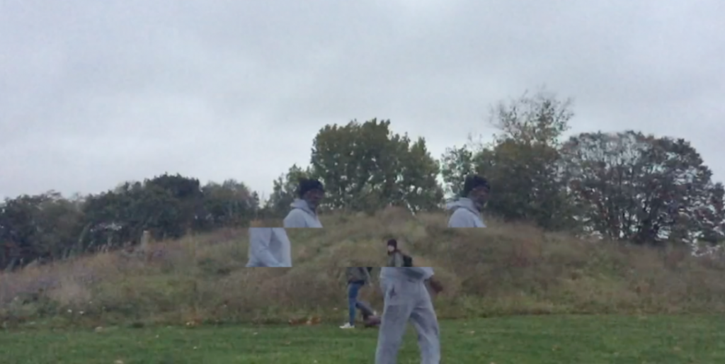
Burgess Park Glitch

Using footage from when I sat in Burgess Park for 3 hours one morning as part of our Practice Workshop along with the wonders of iMovie, I put together a super simple test shot of a possible moving image technique I want to explore further. This has been inspired by the work of both recent Slade Graduate Luke Clayton-Thompson, and film-maker Joachim Koester, who made a film about a Polish opera director who made his actors go through training exercises in remote rural locations, with no audience. The idea of performing to a landscape is very interesting to me, and something I feel could tie in with the wrestling element of my work at the moment.